
What Makes Packaging Design Read as Premium
Two containers can hold the same volume and sit on the same shelf, and one will read as expensive. Very little of that is decoration. Most of it is geometry.
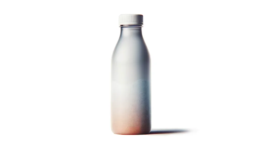
Two bottles can hold the same volume, cost the same to fill and sit side by side on the same shelf, and one of them will read as expensive. Very little of that is decoration. Most of it is geometry, and nearly all of it is decided before anything is manufactured.
Packaging design is usually described as how a container looks. It is more useful to treat it as three problems solved at once: what the product needs, what the shelf rewards, and what the process can actually produce. A design that answers only the first two is a rendering. A design that answers only the third is a container.
Concept: deciding what it is before deciding how it looks
The concept stage is where the container is still an argument rather than a shape. What has to go inside it, how it will be filled, how it will be carried, how it will be opened, how it will be stored, and what it has to say about the brand from three metres away.
The useful output of this stage is not a pretty picture. It is a short list of constraints everyone has agreed to: capacity, closure system, material, process, and the two or three things the container has to do better than what it replaces. Every hour spent settling those is an hour not spent re-cutting steel later.
Industrial design: proportion before ornament
Once the constraints are fixed, industrial design does the work that people actually respond to, mostly without noticing. Three things carry most of it.
- Proportion: the relationship between height, diameter, shoulder and neck. A container reads as considered when those relationships look deliberate, and as generic when they look defaulted.
- Stance: how the container meets the shelf. A base that is visually stable and a shoulder that carries the eye upward do more for perceived quality than any graphic treatment.
- Grip: where the hand goes, and whether the container invites that or merely permits it. Grip is where design stops being visual and becomes physical.
What actually makes a design read as premium
Ask why one container looks more expensive and the answer is usually surface quality, described imprecisely. It can be described precisely.
Surface continuity, and why G3 matters
Where two surfaces meet, they can be joined at different levels of smoothness. The convention runs G0 to G3, and each step changes what light does across the join.
- G0, positional: the surfaces touch. There is a visible crease. Light breaks sharply at the seam.
- G1, tangent: the surfaces share a direction. The crease is gone, but a reflection crossing the join still kinks noticeably.
- G2, curvature: curvature matches across the join. Reflections travel across it without a visible break. This is the level most quality packaging is held to.
- G3, curvature rate: the rate of change of curvature also matches. Reflections do not merely stay unbroken, they accelerate smoothly. This is what makes a highlight glide down a shoulder in one uninterrupted sweep.
You do not consciously see continuity. You see the reflection it produces. A long, clean, continuous highlight running down a bottle is read by the eye as precision, and a highlight that stutters is read as cheap, even by someone who could not say why. This is why the difference between G2 and G3 is worth paying for on a hero container and not worth arguing about on a bulk industrial one.
It is also why premium surfacing is a tooling question, not only a CAD question. A G3 surface in the model becomes a G3 surface in the part only if the cavity is machined and polished to hold it.
The rest of what separates good from ordinary
- Parting line placement: every moulded container has one. On a considered design it is hidden in a transition or aligned with a feature; on a careless one it runs across a face where the light catches it.
- Wall consistency: uneven walls sink, warp and distort reflections. Consistent walls look better and run better, which is rare enough to be worth stating.
- Radii discipline: a small set of intentional radii reads as a system. A dozen arbitrary ones read as accident.
- Label geometry: the label panel has to be genuinely flat or genuinely cylindrical. Applying a label to a subtly compound surface is how good packaging arrives wrinkled.
- Closure integration: the neck, the closure and the container should look like one object, not a container with a lid found for it.
- Material honesty: PET, HDPE and PP each have a natural gloss, clarity and stiffness. Designs that work with those properties look better than designs that fight them.
Design that survives contact with manufacturing
The most common failure in packaging design is not ugliness. It is a design that cannot be made at the price, at the rate, or at all, and gets quietly degraded until it can be. The degradation is where the premium goes: a radius opened up, a shoulder flattened, a parting line moved somewhere convenient.
Designing around the process from the first sketch avoids that. Draft, wall thickness, stretch ratios, pinch geometry and ejection are not restrictions applied to a finished design; they are part of the material the designer is working in. When they are treated that way, the container that reaches the shelf is the container that was drawn.
That is the whole reason product design, mould design and simulation sit in the same team here. The design is proven against flow, cooling and wall thickness before any steel is cut, so the shape that wins the shelf is also the shape that runs at rate.
Have a product that needs a container, or a container that is not earning its place? Bring a brief, a sketch or a sample.
Advanced Molds Technologies engineers and builds packaging tooling in Amman, Jordan, serving brands across Saudi Arabia and the GCC. If this piece is close to a problem on your line, our packaging product design services are where to start.


